Research
We play the build the way your players do and record it. Then we run a heuristic pass against how people actually read screens — scan order, grouping, contrast, load. We watch, we don't guess.
Session recordingsHeuristic pass
UXHaven is a UX/UI lab that works on one thing: game interfaces. We study how players read your HUD, menus and inventory, then hand you a clear plan to make them understood at a glance.
Most games don't lose players at the fight — they lose them at the screen before it. We focus where confusion hides.
Health, resources, cooldowns, objectives — everything the player checks mid-action. We measure how fast the eye finds each value and cut the noise that costs a reaction.
Pause screens, options, key rebinding, save flows. We flatten deep trees, name things the way players think, and make the "where is that toggle" question disappear.
Grids, crafting, loadouts, skill trees. When a game has a lot of stuff, the interface is the game. We group, sort and label so managing gear feels like play, not paperwork.
The opening minutes decide who stays. We map where new players stall, replace wall-of-text tutorials with in-context teaching, and get people to their first real decision faster.
No taste debates, no "we'd move this here." Every recommendation is traced back to something we watched a player struggle with. That's the whole discipline.
We play the build the way your players do and record it. Then we run a heuristic pass against how people actually read screens — scan order, grouping, contrast, load. We watch, we don't guess.
For the parts that need more than a nudge, we build clickable alternatives — often two or three directions, not one precious mock. Cheap to make, cheap to reject, so the good idea can win.
We put the prototypes in front of people who match your audience and give them real tasks: find the map, equip the better weapon, change the controls. Where they hesitate is where the design still fails.
You get a written report, annotated screens and a ranked backlog your team can pull straight into a sprint. No 80-slide deck nobody opens — the shortest thing that gets it fixed.
Two anonymised examples from studios we've worked with. Same game, same content — the interface just stopped fighting the player.
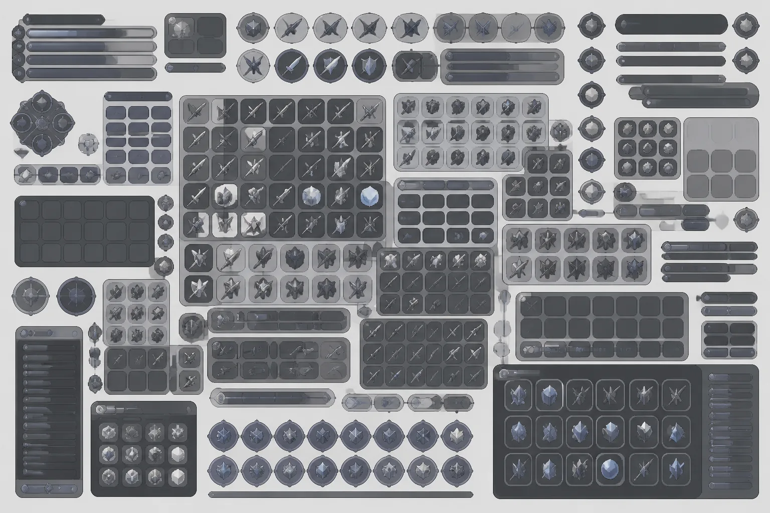
Weapons, food and crafting parts shared a single 60-slot grid. Players scrolled to find gear mid-raid and died holding the wrong item.
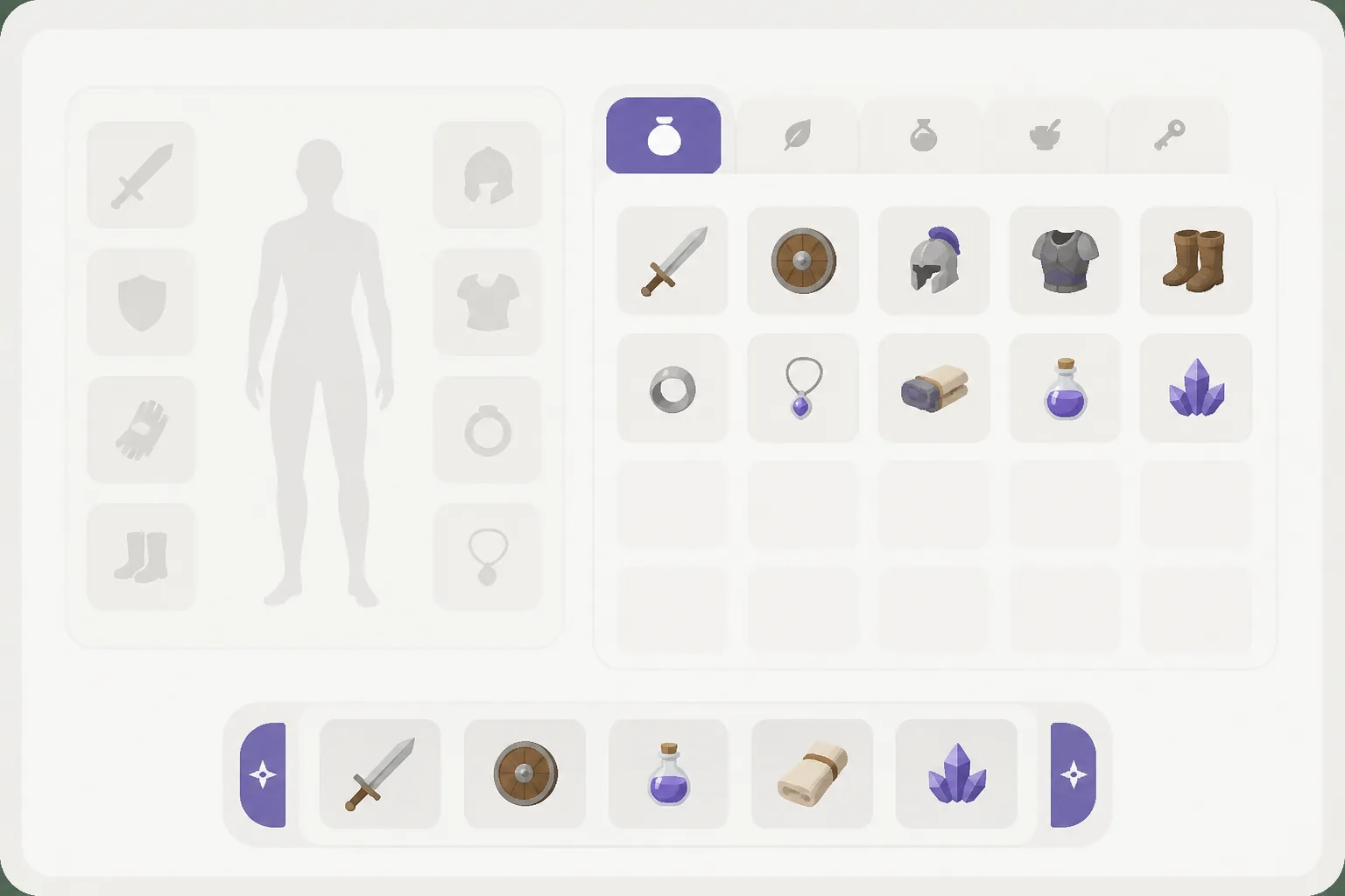
We split the grid into tabbed categories with a fixed quick-bar. Equipping the right tool dropped from a scroll-hunt to a single, predictable move.
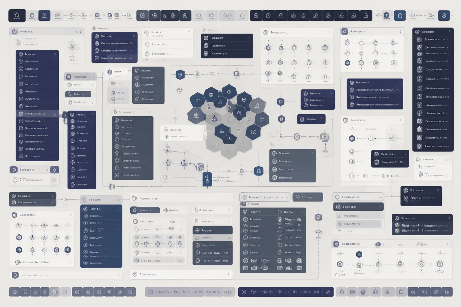
Nine tooltip pop-ups fired in the first minute, and the difficulty toggle sat four screens deep. New players bounced before their first real turn.
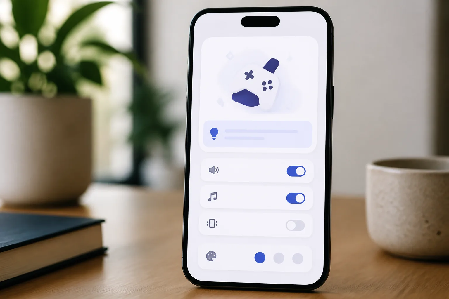
We replaced the pop-up wall with hints tied to the action, and lifted the key settings to the first screen. More players stayed long enough to get hooked.
Ten to fifteen pages, not a hundred. Each finding says what's wrong, why it costs the player, and what to do — in the order that matters.
We take your actual screens and pin every problem to the exact element — the way we mark up the mock at the top of this page. No abstraction, no translation needed.
For the parts that need real work, two or three redesign directions with the trade-offs spelled out — so you're choosing between clear options, not staring at a blank page.
Two producers who commissioned a Game UI Audit — on what actually changed once the interface stopped getting in the way.
We shipped three updates trying to fix our quest log ourselves and players still missed it. The audit found the real problem in an afternoon — it wasn't the log, it was where the eye landed first. After the regroup, players stopped missing the quest log entirely, and our "where do I go" support tickets dropped by a third.
 Marta Kowalczyk
Executive Producer · Nightfold Studio
Marta Kowalczyk
Executive Producer · Nightfold Studio
What sold me was that nothing was a matter of taste — every note traced back to a clip of a real player hesitating. The ranked backlog dropped straight into our sprint board, no translation needed. Two of the quick wins took an afternoon each and cut time-to-equip on the crafting screen almost in half.
 Julien Brandt
Studio Lead · Ember & Oak Games
Julien Brandt
Studio Lead · Ember & Oak Games

3 "The one-page summary is what got the whole team to actually read it." — Priya Anand, Design Director · Copperlight Interactive
No hourly meter, no surprise scope. You know the number before we start.
A full heuristic review of your interface, delivered in about ten working days.
When you want us to design the fixes, not just point at them. Booked after an audit.
Prices are in Polish złoty (zł), excluding VAT. Larger titles are quoted after a short scoping call — no obligation.
A written report, a set of annotated screens marking every issue, a prioritized list of fixes ranked by impact and effort, and two or three redesign directions for the parts that need more than a patch. Plus a call to walk your team through all of it.
No. We work from a build or a screen recording plus your interface screens. If you can play it, we can audit it. Engine or repo access only comes up if you take the follow-up redesign sprint and want us to help with handoff.
Roughly ten working days from the moment we have a playable build in hand. If you add the redesign sprint, that runs another two to three weeks depending on how many screens are in scope.
Anything with a screen the player has to read — RPGs, strategy, survival, roguelikes, sims — on PC, console or mobile. Inventory-heavy and systems-heavy games are exactly where an interface lab earns its keep.
That's the normal case. We sign your NDA before we see a single screen, keep builds off shared drives, and never show work in public without written sign-off. The case studies on this page are anonymised for that reason.
Send the basics and we'll reply within one working day with next steps and a slot. No payment on this form — we invoice once scope is agreed.